AS WEBSITE EVALUATION
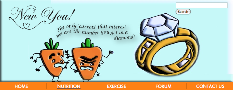
My website is similar to the websites I researched as the most frequent conventional layout used contains a banner and three columns. We decided to use this layout for our website, however, we used a navigation bar underneath the header, whereas, on most websites, the left hand column is usually ‘indexed’ to navigate you around the site and the right hand column is for links to other sites. We decided to use the right hand column for advertising the ‘WeightWatchers’ campaign who we have said have sponsored us, and the left hand column as links to other websites which we found relevant. On each page, for example the recipe page, we put links about recipes from famous chefs such as Nigella Lawson and Jamie Oliver. We used famous chefs because we thought they would be inspirational for our audience to follow their recipes. Also, majorities of the population follow celebrity icons as they look up to them. We thought this would be a good idea to attach links relating to each page for the audience to gain a greater knowledge on the topic. Unlike most conventional websites, we did not use the most commonly used colours, which are generally pastel colours for backgrounds, however our website was not too bright, as the colours were not fluorescent so it did not repel the audience. Our background was white for each page, but we decided to use different colours that were slightly brighter for our boxes to attract the audience to the positive idea of health. We used certain colours to reflect the mood, for example, the red on the exercise page reinforces the energetic mood and getting your blood pumping, whereas on the nutrition page we used orange to remind the audience of carrots, as this is what was drawn in the banner on the nutrition page. The colours we used were bright and exciting, as we felt that we wanted the audience’s mood to be lifted due to the colourful pages.
In retrospect, our website is different to the websites we researched as we challenged the way how most health websites seem to almost force the audience into certain diets, for example, strict “Do’s and Do nots”. Contrasted to this, the information on our website is not too strict and we felt that, if the audience is more interested in their diet, they are more likely to stick to it. We also included a colourful hand-drawn banner with a slogan as we felt this was a lighthearted way to engage the audience without them feeling too pressured.
We have arranged our website in such a way that it has a positive effect on our audience, as previously mentioned, there is not too much information and it is cheerful. This encourages the audience to respond in a positive way because they feel that we are talking to them, not telling them what to do. A conversational aspect engages the audience leaving them feeling relaxed and feel that they could confide in us.
I feel that we used the conventions effectively for our own site because it is different to other websites, yet still looks like our researched websites as the conventions are the same – the layout etc.
The written language we used is Standard English, however, as well as the humour we included in the banner, we decided to add a bit more to our information to keep the reader engaged, as we felt this was a good way to do so. However we did not go off the fact that being healthy is extremely important in one’s life. An example of the humour we used is on the ‘Recipe’ page is “Eating breakfast is extremely important to get your body and brain functioning in the morning. However, a double espresso and a pastry is just about the worst thing!” We felt that using conversational undertones would involve the audience. To make the site individual to our cause, we made everything look friendly, without the audience feeling that they are being forced into looking good; we wanted the audience to know that they already do look good, but there are a few tips on the website on how to keep healthy. Our website is not necessarily about losing weight, but to be aware of how important knowing your weight is – the reason why we used the BMI chart HTML on the exercise page for the audience to interact with. This is a way of how people could be aware of their weight and BMI and we included ways of what to do about it. We ensured that people could find their way through our website in a way that they are used to by using a conventional layout with three columns and easily readable links. We have arranged, created, coloured, placed, and linked all the elements of our site in such a way so that the audience understood our website conventions. The effect this has on our audience is that they are more likely to carry on reading our website as first impressions are extremely important. This encourages their response to our site in a positive way because they are to find that the information will be beneficial to them after browsing the website because it looks eye-catching.
Initially, we expected our health website to be aimed at everyone who were not too interested in strict dieting, but just a way to eat healthily. We thought it would be difficult to attract a male audience as well as females because women are generally more likely to be slightly more considerate with their health. The demographics our media product aims at is probably any class group as our information is not too formal, yet not too informal either. In our survey we found that females are more interested in their health than males. Despite this, we tried to include as much as we could to attract a male audience to keep it balanced. Perhaps if we were to create our website again, we would consider how to attract the male audience as well as keeping the female audience present. There is no particular age group our website is aimed at and we feel that it could attract any age audience because there is information and tips for an older audience to read yet not too much information, pictures and interactivity for a slightly younger audience so they do not become uninterested. The layout is neatly set out on each page into three columns with colourful shapes and text to attract a slightly younger audience. Perhaps these bold colours are not very practical for an older audience as they may feel the website looks ‘childish’ as, conventionally, children’s websites are bold and colourful, whereas older audiences use pastel, less bold colours. This could be a problem as it may lose an older audience based on first opinions, even though the information might be useful to them.
Our website has a wide variety of things about health that will help all social groups coming from any class to feel confident to lose weight before summer. They will be able to ask questions and get professional advice on our Question & Answers and Contact page. The photographs we used on our website are conventional as they are fairly basic, and we decided not to use many. We created our own images for our banners on each page by drawing and scanning in the image to edit on Photoshop. We added colour and shadows to each layer and placed each banner at the top of every page. When editing the photographs, contained within the text, we edited the brightness and contrast. The effect this had on our audience is that colourful photos are more likely to attract viewers, whereas, if the photographs looked dull in colour, the audience may, subconsciously, be uninterested. The video on the Recipe page is useful for anyone from any social group as it is cheap and simple to make and can be made by someone of any age. The language we used addressed our target audience, and the words were easily readable, as the font, Futura, was clear. We made sure the font size was consistent throughout the website so the website flowed and it could also be interpreted by showing a consistency in diet. We have chosen the colours and font etc because they are easily readable and make our website look friendly as the colours are not too dark – connoting a dull website.
The first issue with distribution is that anyone can do it. This may be a problem because if anyone can easily publish their own website, websites may become less useful for advertising institutions. Websites can be edited frequently, unlike newspapers, which need to be edited before publishing and need huge capital in order to get an issue printed and distributed. There is also a risk that sales may not be as expected. People can easily make a website look professional, however, people may trust websites too easily if they look conventional. Newspapers need a lot of people for different jobs, whereas websites do not need many people in order to publish it. People can easily make their own film or programme, yet it is institutes that decide what is put on television, the same with radio programmes, whereas no one decides what websites are published and there are thousands. Our website is sponsored by ‘WeightWatchers’ which makes our website look professional as a proper weight loss company sponsor it. After researching, I found that it does not show a clear chain to distributing the website from production. It may be difficult to have your website found as anyone can advertise their website on Google, or any other search engine, but you have to wait until people find it. All of this publishing relies on digital technology as this is the most common route for people to pursue. Things can easily be leaked on the Internet, which is illegal, and the simplicity of this distribution could be a problem.
Using our survey we created for our research, we found that we have identified our target audience as being more for females than males but we found it difficult to find what social group our website should aim at. We took our results and put them into pie charts (which are on my blog) showing our findings.
Our website reflects the needs of the audience as it is simple and easy to navigate around yet contains the relevant amount of information so the visitor is not to get bored. Photographs are included to attract the audience and there is a video for the audience to watch and interact with as it is something to do themselves. Our main discoveries from the survey are that our audience wanted healthy recipes, advice on how to lose weight and useful diets, therefore, this is why we included a Diet, Recipe and Exercise page containing useful information for our audience. We also found that the majority of people who answered our survey said that fad diets are overrated – this helped us know what sort of diets we could include on our diet page. Lastly, we thought it would be useful to find what our audience would like to see on a health website. Although drink driving was our highest factor, we thought that, because fitness was one of the lowest, it would be essential to bring the importance of this to the audience’s attention as Britain as a community is becoming overweight. We also found that the majority of people wanted to know about sexual health, woman well-being and anti-smoking, therefore, we included little, but relevant, amounts of information for this. It represents the audience because our survey showed what the audience desired and we took this into consideration, adding the relevant information to our website. Overall, the survey helped to give us ideas on what we will include for our website and aim our information and pictures to suit our audience.
Since making our preliminary website, I have learnt a lot about technologies from the process of constructing our product. My attitude was more focused on detail than in my preliminary website. Unlike my preliminary website, I used more software such as Illustrator and Final Cut Express. These programmes were challenging because I found it difficult editing the sound of the video as it seemed fairly echoed. However, the outcome was proved effective as, in the end, it sounded normal. As in my preliminary website, I used Photoshop to edit my photographs and I also used the scanner to scan in my drawn banner to be edited with colour and embossed in Photoshop. I have learned how to use many programmes effectively and learned to consider the audience from researching different age groups and basing our website on the results from our survey.
Looking back at my preliminary website, I feel throughout my progression from it to my final product I have paid more attention to detail and learnt to use the software appropriately. I feel that our website has contained all the correct information for our target audience and the colours and layout are useful because we considered how our audience could easily navigate themselves around without being confused by the layout. Our process was very careful and exemplary as it works as a good example of a health website since we researched health websites and used our survey to see what people wanted in a health website that they would use. Our main website contains a lot more detail and information and I had to consider the rollovers for all the links and to make sure the website was consistent throughout the pages, although, together we decided to change the colour on each page as we thought this was interesting and exciting to have as a theme and to keep the audience interested. Our website creates pleasure when the audience use the site as they can be involved with the interactivity, for example, the BMI calculator or ‘poll of the week’ as it is rewarding, fun and easy to use. The links take the viewer to other closely related sites as there are certain links on each page. It is easy to return back to the previous page, however we could’ve done a back button on each page – but this would be difficult depending on which page they are navigating from. The video has controls to play and it uses Quicktime. This is our only form of audio as we felt viewers may be frustrated if music were to play automatically and it could disturb people.
Overall, I have gained greatly from creating my websites (preliminary and main) and have used a range of software that may be useful in the future. There were not many difficulties throughout my process, however, I think if we were to create our main website again, we would consider how to attract our website at more social, age and gender groups, particularly male (perhaps we could have created a ‘male’ page). We would also add more interactivity as I feel that our BMI HTML was an exciting extra to our website. Adding more things similar to this may attract more of an audience where the institution may respond. It was interesting to create my own website and to attach everything I wanted to make sure the website was concise and looked neat. The challenging aspects were, that it was fairly difficult aligning all the information correctly and keeping everything consistent. The HTML’s were fairly difficult as some we tried to include did not work. We also had trouble with the main website as the font we decided to use for titles did not work on certain versions of the internet and we had to check this on as many types of browsers as we could. Our health campaign may help to counter the dramatic increase of obesity throughout all ages in Britain. People are not interested in harsh diets as they feel they cannot succeed in following a strict diet. Therefore, this is why our website is friendly and emotive.
Charlie Woollard
Tuesday, 10 May 2011
Wednesday, 20 April 2011
Final marking
Charlie, have a look at the front page of my website. Your website is really high marks, but the blog is still a bit dull - no illustrations, pictures, charts and colour. Treat it as creative as well as factual. There are some problems with the font (EdwardianITC?) that you have used, and we need to work around this by taking screenshots and using them. A lot of browsers don't have that font available, and this causes problems.
HM
Saturday, 9 April 2011
7th April 2011 - Checking
Finally, our website was complete! We made sure we checked every link worked effectively and was brought to the front. We proof read the information on every page to check for spelling and grammar mistakes and made sure the text and images were aligned. Our website is complete!
Here are print screens of my four pages:


Above is my nutrition page - I used orange to colour coordinate with the carrots in my banner as I thought this looked effective. The picture of the fruit represents nutrition and we edited this in photoshop.
To the right is my Recipe page with our video present at the top containing our weekly recipe. We thought this was a good idea as the audience can do this themselves, interacting with them and we made a smoothie because the audience could add in their own fruit to preference.


Above is the Diet page with a humourous quote at the top as it relates to most women. The picture is of a stomach with a tape measure as women are always concerned with their weight and appearance. To the right is the Forum or Question and Answers page where there is a large box for our audience to as questions that are answered by professionals - or Dr NewYou!
As you can see the layout looks consistent throughout and the creative banners add an exciting feel to the website. Overall, I am pleased with my outcome.
4th-6th April 2011 - Links and Advertisement
Today we added links and articles to every page on the left hand column, for example, on the recipe page I added Jamie Oliver's website as a link as this may be useful to visitors. To make the website look more realistic, we added an advertisement in the right hand column for Weight Watchers. This was consistent throughout and made the website look complete.
Here is a print screen of our left hand column on one of our pages - as you can see, in our rollovers we use complimentary colours.

On the right hand column we added a 'WeightWatchers' advertisement taking the audience straight to the Weight Watchers website. Here is our advertisement:

4th April 2011 - Html
After all of our text was included on the website, we added any extra html's we needed such as contact boxes and a BMI calculator for the weight page. We also attached search engines on every page in the top right hand corner of the banner as, after doing our website research, we thought a search engine is relevant for every website. Here is an image of the search engine.

Here is our HTML BMI calculator.

31st March 2011 - Text and Information
As our design was complete, we now needed to look up information for each page and decide how much and what text would be relevant. We made sure the text and size was the same throughout the website to keep it consistent. We used the font Futura throughout.
Here is an example of the text on the Nutrition page:

We added a 'splash' to show attract the audience to show the new pages as we thought this was an effective way in engaging our audience as their eyes are automatically placed on this.
27th March 2011 - Story Board
Today Lauren and created a story board for our video that we decided would be suitable for the recipe page. We didn't want to make the video too long, so the visitor would become uninterested, so we made a 'one-minute movie' with an easy recipe, which we decided to make a healthy smoothie.
Here is our storyboard and video:

25th March 2011 - Photographs
After editing our banners on photoshop, we started to create shotlists for our images that were going to be included on the website. We edited these on photoshop to create shadow and perfect lighting for the image. Here are a few of the images we used.


(all first-hand photos)
We thought these images were suitable for the website and they were relevant to the pages we decided to place them on.
Tuesday, 22 March 2011
21st March 2011 - Website
Lauren and I have now started to apply our design to iWeb. As each page has the same layout we have made sure to apply this to every page. We have also started to create our banners by drawing in the design for each page and scanning it in ready to be edited on photoshop.

We drew lots of designs we thought we could use for the logo on our website four our company name 'NewYou!' We then created this on Illustrator by connecting the 'N' of the 'New' and the 'Y' of the 'You' connected with a heart inbetween - showing to have a healthy heart. We are pleased with our design.

With this, we added the logo to our banners. Here are my edited banners.


Overall, all of the puns on my banner are fairly humourous, attracting the audience. I did not have many difficulties in creating the drawings on Photoshop and had a fun time making them.
Thursday, 17 March 2011
17th March 2011 - Sketch plans
For the past week, Lauren and I have been adding detail to our sketches as well as colour and the information we are going to include. When each page is completed, we are going to scan the plans in and post them on our blogs and then begin to create our website, following our plans. There may be some things that we will change after starting our website as we may find some things more appropriate than in our initial ideas.
Here is a sketch of the 'Diet' page:

Here is a sketch of the 'Recipe' page:

Here is a sketch of the 'Nutrition' page:

Lastly, here is a sketch of the 'Forum' page:

As you can see, the layout is consistent but with different images on the banner and different coloured themes on each page. These are the four pages I am going to create.
Friday, 11 March 2011
Wednesday 8th March 2011 - Sketch plans
Today, Lauren and I began to sketch plans for every page on our website. We photocopied the same navigation bar and links throughout and put this on every page, as all pages are going to follow the same theme, but we decided to use different colours for each page to make it more exciting. We decided that for the banner we are going to use a different image and pun for each page, relating to the page.
Here is our basic layout:

Thursday, 3 March 2011
3rd March 2011 - Survey
Today, Lauren and I created a survey to collect information for our website. This included demographics and psychographics to find out what different members of the public are like and would want to see on a health website. Questions included: "What would you like to see on a Health website?", "Do too many people rely on fast food?" and statements such as: "Fad diets are overrated." We are going to hand this survey to 30 people and analyse our findings when all surveys are completed. This will help us on what to include on our website and how to attract all age groups.
Here is our survey:
From our survey, we found that the thing our audience wanted healthy recipes, how to lose weight and useful diets (as seen in the pie chart below) so, therefore, we decided we will include a diet, recipe and exercise page for useful information for the viewer.

More findings from our survey to take into consideration for our website are whether fad diets are overrated - so we could consider what type of diets the audience would like us to include. Here are our findings.

Lastly, we thought it would be useful to find what our audience would like to see on a health website. Although drink driving was our highest factor, we thought that because fitness was one of the lowest, it would be important to bring the importance of this to the audience's attention as Britain as a community is becoming overweight. We will also include little amounts of information for sexual health, woman well-being and anti-smoking.
The survey has helped to give us ideas on what we will include for our website and aim to suit our audience.


Tuesday, 1 March 2011
1st March 2011 - Brief for Main Website
After researching many websites relating to our topic, Lauren and I came up with a brief for our main website. Here is our brief showing what our website will include:
For our website, we are going to produce a campaign website about health. Our website will be about living a healthy lifestyle, teaching people how to eat well and encouraging them to exercise more. Our website will include bright colours and exciting informational pictures. We will also include a video, perhaps interviewing a personal trainer or someone who leads a healthy lifestyle. Here is a list of the pages we will include: a home page, nutrition, recipes for healthy meals, ways to exercise, a forum for visitors to ask questions, weight (BMI, calorie counting etc), diets, a contact us page. We will invent a company name and create a logo suitable for the topic. The navigation bar will be present on every page for easy navigation for the visitor of the website, however the picture present on the banner at the top of the page will be different for every page, relating to the particular page showing a consistent layout.
Wednesday, 9 February 2011
8th-9th February 2011 - Research into websites
On the 8th and 9th of February, we started to research into a variety of websites for our campaign. We print screened and annotated sections by using subject terminology and wrote a short report based on our analysis and findings.
We researched 4 websites with 2 pages on each.
Here is part of our research.
7th February - Planning the main website
In our lesson today, we read what the exam board expected:
“produce a campaign website including sound and video for a campaign (eg political, health, charity, environmental). The site should include a logo, original photographs, (minimum four per candidate), written text, audio, video and easy navigation. If done as a group task, each member of the group to produce at least four pages for the site, following the same house style."
After taking this in to account, we got in to our groups, Lauren Jackett and I, and began to make initial notes on our intentions. Lauren and I decided to base our website on health and about living a healthy lifestyle.
6th February - Media page on preliminary website
After completing the home page of my preliminary website, I began to create the Media page. I decided to include the video on this page as I thought it was relevant and included information about the Media Studies department at Copperfield School. I took first hand photos, editing these slightly in Photoshop and included these on the Media page. I made sure the banner present on the home page was also present on the Media page to continue the theme throughout the website. I included links back to other pages at the side for easy navigation for the visitor.
Here is a preview of what my Media Studies page looks like:

Here is the video for you to watch:
4th February - iWeb continued
I continued working on my preliminary website, making sure relevant information was included including announcements, useful links and a welcome from the Headteacher. I have now finished the home page for my school website, attaching links to blank pages, but will now need to do the Media page for the school website, continuing on my website's colour theme, keeping the navigation bar present on all pages.

5th February - Media page on preliminary website
I then planned my media page for my preliminary website, making the theme similar to that of the homepage to make the website consistent, but planning where the information and pictures were going to go.
31st January - iWeb continued
I have now nearly finished my preliminary website. Today I worked on photoshop to create my school logo and school title. I experimented with different effects (for example to create a shadow) and attached this to my website. I now need to add photos or a video before completing the home page for my school website.
Here is a picture of my school logo.

28th January - iWeb continued
Today I continued on my website, now adding colour and text to my page to make it look exciting. The colour I used is different from my original page layout colour as I feel I needed slightly more subtle colours as the website is to be generally for parents and too bright a colour may be off-putting.
27th January 2011 - Developing my website
After experimenting on iWeb previously, I started to create my preliminary website my following my page layout I hand drew. For the first lesson on working on my website, I started to arrange the boxes around the page, making sure they were aligned so it looked neat.
26th January 2011 - Setting up iWeb
Today we learnt how to use a new program called 'iWeb'. This is the program we will use for our preliminary website so we began to experiment with the different things we could do in order to create our website.
Tuesday, 25 January 2011
25th January 2011 - Page Layout
I finished my page layout to make it look neat and contain everything I am going to do for my website.
I am going to include a banner at the top of the page with the school name, logo and slogan. I will design all of this in Photoshop with the appropriate font for a school website. I will have three columns - as I found that this is what school websites conventionally use. In the middle column I will use moving images to show the school and links and information on either side of this. I will also include a search bar and a newsletter where parents can enter their email address to retrieve this. A Headteacher's welcome is present on every school website I researched describing why it is the right school for your child, so I will include this.
My media page will be consistent to the homepage keeping the banner present, however there will be images and a video on the right hand side and information on the left. My colour theme will be fairly basic and not too colourful as parents may be 'put off' if the website looks too childish.
24th January 2011 - Design
I finished my brief and then started to design my page layout, including colours and the links I am going to include.
21st January 2011 - Brief
On the 21st of December, I started to write my brief on what my school website was going to include. I included things such as colour themes, layout and the content of the website.
The list -
Hi Charlie -
Your blog is looking very good. This is a list of work to check against so that everything is in place.
Creating your blog.
Using a camera introduction
Photoshop your picture/s and post to blog.
Research on four school websites: 400 words short essay.
Survey.
Catchup, including survey, annotated websites.
Draft brief for preliminary site.
Page layout.
Photoshop, first artwork.
HM
Thursday, 20 January 2011
20th January 2011 - Survey
After planning the survey in the previous lesson, my partner and I began to put the information into tables ready to print off to be answered by 10-15 parents with children currently in education. Here is what my survey looks like.
19th January 2011 - Survey
On Wednesday the 19th of January, I began to plan my survey and consider different formats of questions such as rating in order of preference and multiple choice answers. I began to think of different types of questions including demographics (information about the person) and psychographics (what the person likes). Overall I planned 8 questions.
Wednesday, 19 January 2011
18th January 2011 - Site Research
On the 18th of January, we researched different school websites such as Ravens Wood School and Hayes School. We compared the websites to see the different techniques the schools used to present themselves. I found that common conventions in websites are in the layout - including positioning on the page, as well as fonts and photographs. I also found that the colour themes used for the websites were generally the colour theme of the school, such as blue for Hayes School and green for Ravens Wood. Here is my preliminary website research on different schools.
17th January 2011 - Using Photoshop
On the 17th of January, we edited the photographs from the previous lesson on Photoshop, experimenting with colour, brightness and contrast. We also made the object in the foreground come in to focus by taking an extract and blurring the background. Experimenting with Photoshop helped to see what techniques could be useful for photographs later throughout our production work. Here is an example of how I edited one of the photographs.

I changed the contrast and colours and then added a 'grain' effect - giving the image a slight texture. I think this looks effective, however, maybe I could make the two characters stand out more.
14th January 2011 - Using a Camera
On the 14th of January, we started to take photographs, considering light and the background setting. We took close up photographs and photographs which were taken from a slight distance. We are going to use these photographs to edit on Photoshop in the next lesson. Here are a few photos to show how we considered lighting and positioning.


13th January 2011 - Setting up Blogspot
On the 13th of January, we signed up to Blogspot to create our blog. We changed the background, font and layout to make the blog more personal. Here we can post what we achieve throughout lessons for our production work.
Subscribe to:
Posts (Atom)